If you read How to Write Content for a Brochure, you will have most of the text outlined for your brochure. But much of its success is in the organization and presentation as well.
Many options
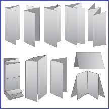
The typical trifold brochure may be boring and overused, but it’s still effective. If you are not planning on inserting it by machine into thousands of envelopes, you can consider a “Z fold” instead of a “letterfold” (standard roll). This can be a standard 8.5×11 or 8.5×14 (consider the size of display racks if you are distributing that way….)
Of course, there are more options…. Half folds, 4 panel roll folds, gate folds, etc.
Part of my days (the best!) are spent playing with paper and thinking of points and centers of impact. I always like to tease and intrigue with a question or problem and then offer a solution. The unraveling of a fold can do just that. Take a few pieces of paper and create a variety of folds.
Adding Content
If each area of the content you wrote had a title, place that title on the various panels of your papers. How does it flow? Is there one format now that becomes the obvious winner?
Prepare for “at a glance” readers
Short sections with subtitles work well. People don’t want to be half way into a paragraph before deciding if this information is even relevant. Include items such as “Why we are different,” “How to sign up,” etc and help guide the eye. Sections divided by different color backgrounds can also be helpful for this purpose.
If you can say it with graphics, do
There are people that like words and people that like pictures. Don’t ignore either. If you are talking about “launching an opportunity,” include some text in the body of a rocket, or a bar chart made of rockets…. Also, if you are calling for human affirmation, images of human expressions that are relatable can speak volumes to the emotions.
Make it appealing so they will want to read it
Add beauty, intrigue, humor, something to ensure it is picked up and read, and while it is important to be informative, remember that you can refer readers to your website: Don’t make your text size smaller to accommodate more words. If you can’t fit what you want to say on a page or section, you’re saying too much. In addition, speak to your audience. Ensure fonts are the right color and size to standout out and be legible for all eyes.
Is a response required?
This is tricky. Figure out early on what they are to do with this information since it may change your entire design. If the brochure response will require a form that includes personal information, you will need to include a envelope, detachable card, fold and glue, or a URL.
Is it a keeper?
Remember that if they are to detach something for response (form) or usage (e.g.coupon), what they are left with matters. Ensure they are left with the most important information which is the benefit of your offering and the contact or any other follow up and/or reminder information.
Call to Action and Contact Info
Did I say Call to Action? Remember to be very clear with what they should do now that they read your brochure. In a 1-2-3 way, let them 1) Go online, 2) Call, 3) Show up at… etc. Whatever it takes but be clear.
Need more? Email us, Call 310-539-2235, Join our List, and Like us on Facebook
©Crest Marketing, Inc. 2017. Feel free to share but give us credit.

Recent Comments